Monday, 12 December 2016

News event - Colombia plane crash

The Guardian 

Colombia Plane Crash 

The colombia plane crash happened during late November, killing 71 people, most of whom were in the Brazilian Chapecoense Soccer team. This crash supposedly happen due to the plane having lack of fuel and was a tragic day for many families. 

The guardian's Headline was: Colombia plane crash: Bolivia suspends airline that operated flight. 
The guardian covered a range of stories to do with the plane crash, in regards to social group, articles mainly focused on the football players that died as majority of the team died and were important figures in football and to many young people. The age of people involved was mainly over 20 years old but the article itself was aimed towards younger people who follow football but also an older audience as well as it involved more than just the Chapecoense football team being affected. Many of the people affected were Brazilian as many journalists and the football team were on the plane travelling to attend the Copa Sudamericana final. 
The group is represented in a positive way as majority of the story is paying tribute to the victims of the crash and their families. The only negativity in these stories are aimed towards the plane driver as it was his incompetence and misconduct that caused the crash. Normally when victims are involved in stories the journalist is very sensitive so that explains why negativity is minimal in this circumstance. 

The technical methods in this article, such as images and colour, are quite minimal. There is one main image of the crash plane and that is all. The headline is fairly bold and involves a heading then subheading so that people know its about the Colombia plane crash. The language and factual information is fairly detailed and there is a large amount of it which explains more than just the crash, but how it may have happened and the victims and their context of being on the plane in the beginning. 

Mail Online 

The Mail Online Headline was: Bolivia defense minister calls Colombia plane crash 'murder' 

The article itself for this specific news provider was extremely short and not very detailed at all compared to the guardian's one. There was only one image of the plane crash again which could be due to sensitivity on the topic. The headline is extremely bold and could be quite controversial as the word 'murder' is an extremely harsh bold word to use. The article seems to just focus on the main parts of the story and provides a succinct summary of the tragedy whereas the guardian provided a more in depth story of it.  

This story was not the main story for the day it happened and was barely even covered on the news, this could be due it is being a developing country, if this crash happened in North America or the UK this story would have been front page and hugely covered on the news. 

Monday, 21 November 2016

Assassin's Creed analysis

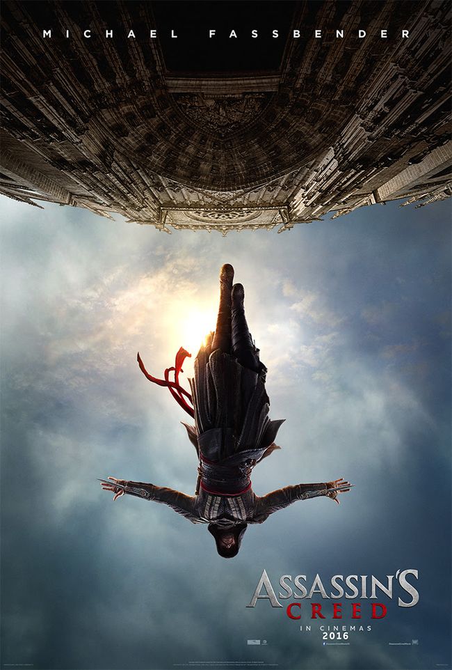
Image result for assassin's creed film poster Image result for assassin's creed film poster

Assassins Creed is an action, adventure movie based off the well known video game franchise. The fact that the movie is an action, adventure movie is displayed extremely explicitly through both the trailer and film poster. 

Visual Codes;

In these particular posters you cannot see the main characters face, but as he is the main and only character on the poster you can tell he is an important part of the movie and the movie revolves around him and 'his journey.' 

The characters body language is exactly the same in both poster, the first image looks like its before the second image as the first one looks like he is about to jump and the second one is of him jumping, this particular act could show bravery in this case. 

His physical appearance isn't very clear in the poster but his clothing is very expressive, the hooded cape cover most of his body to create a disguise and mystery. The colour of the cape looks black and red, red often implies danger and death and black implies mystery which seems to fit perfectly with the whole plot of the movie. 

The location can clearly be seen in the first poster, it looks like a city somewhere is europe. There looks like there are lots of places of worship in the poster which is a binary opposite to the plot of the story as churches and places of worship are associated with purity whereas the movie is about an assassin which is far from pure. 

The title of the movie is fairly small in comparison to the main image and so is the name of the main character, but the name goes all the way across the top of the poster, also his name is the only name there so clearly the movie only revolves around him and his role. 

In the first poster, the sky looks extremely cloudy and dark, like there is going to be a storm, whereas in the second poster once he jumps the sky still looks dark but the sun is creeping through the clouds which could imply freedom. 
  

Monday, 7 November 2016

Narrative Theory

Claude Levi-Strauss 

His theory was that the narrative in films always have a binary opposition. For example, in Western films, The Cowboys are seen as domestic, Christian and inside society, whereas, The Native Americans are seen as strong, savage and outside of society. This theory is relevant for almost every film but especially works in; Superhero movies, Western movies and Fairytales. 

Vladimir Propp 

His theory was that there is always character roles in fairytales but this also applies to many films as well, the major roles are;

  • The Hero (seeks something) 
  • The Villain (opposes the hero) 
  • The Donor (helps the hero by providing a magic object) 
  • The Dispatcher (sends the hero on his way) 
  • The False Hero (falsely assuming the role of hero) 
  • The Helper (gives support to the hero) 
  • The Princess (the reward for the hero, but also needs protection from the villain) 
  • Her Father


Levi-Strauss' theory applies extremely well in The Amazing Spider-Man.
The protagonist in the movie is Peter Parker (Spider-Man) whilst the antagonist is Dr Curtis Connors (mutated lizard man). At the beginning they were both protagonists but as time went on Dr Curtis Connors got mutated and turned into the lizard man who tried to destroy the city.

Image result for the amazing spider man

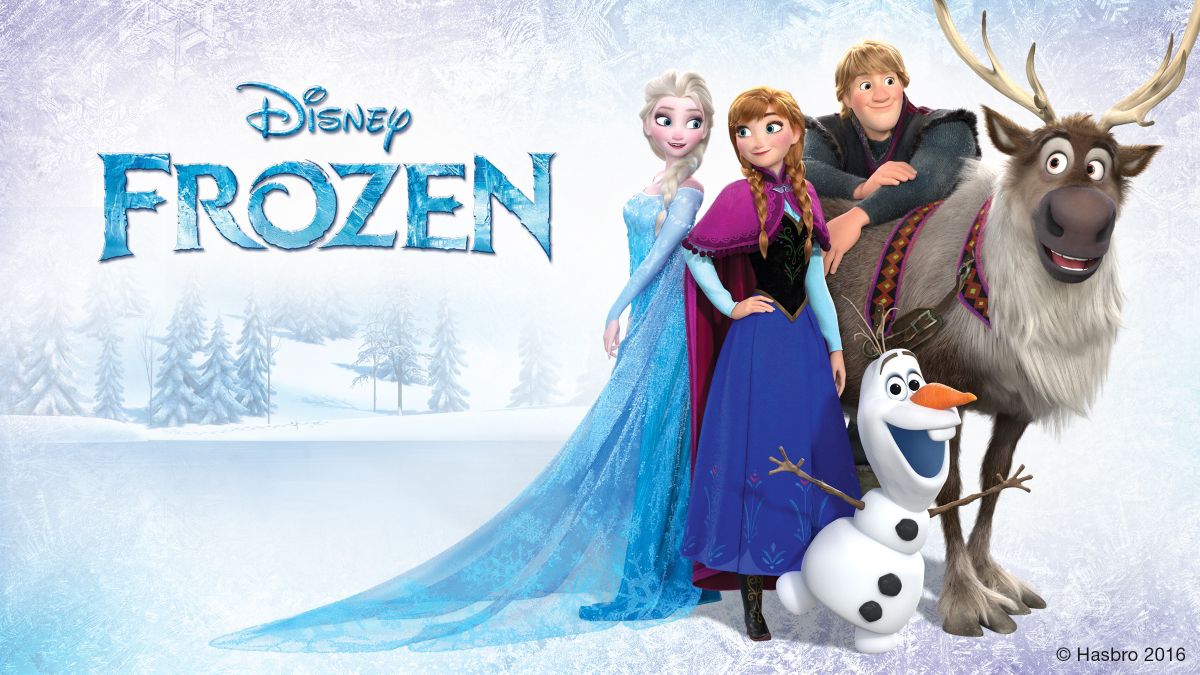
Vladimir Propp's theory applies to various different movies. One that partially sticks out to me is Frozen.

  • The Hero - Anna 
  • The Villain - Elsa (could also be considered a protagonists towards the end) 
  • The Dispatcher and The Helper - Kristoff 
  • The False Hero - Hans 
  • The Princess - Anna and Elsa 
  • Her Father. 
Image result for frozen

Monday, 31 October 2016

Thriller Movie Plan

Title: 

Incognito 

Tagline: 

Join the Revolution. 

Format: 

DVD Cover and Poster.

Genre and Audience:

  • The target audience will be aimed towards teens.
  • Main genre will obviously be thriller but the sub-genre will be crime and revenge. 

Characters:

Protagonist:
  • Lincoln Brown is a police officer who is tired with the law and the way the police treat people so starts a rebellion against them. 
  • Harper Evans is the best friend of Lincoln Brown, also part of incognito group. 
  • Sienna Payne is an original member of the incognito group.
Antagonist:
  • The Police.
Also includes minor characters.

Plot: 

A disastrous occurrence caused by the police forced the citizens of London to slowly start rebelling as a way of revenge. The group known as 'Incognito' start committing small crimes in a way to catch the police's attention and fight back. The group are normal everyday people and disguise themselves with masks in order to not be caught, originally thought up by the main character who is a police officer but disagrees with the rules and principles. Will include twists and murder/assaults and the protagonists being captured. 

Theme and Setting:

  • Theme - Crime and Revenge.
  • My thriller film will be set in Peckham as gang crime rates are high there. 
  • Set during the night in dark secluded areas, to intensify the theme. 

Emotional effects: 

  • The emotional effects could include anger or disgust aimed towards certain characters or the actions they perform. 
  • I think confusion could also come into it as many thriller movies contain plots and themes that can sometimes confuse the audience. 
  • Another emotional effect could be judgement against a situation or again a character or action performed. 

How does it appeal to a teen audience? 

  • It appeals to a teen audience as crime is normally associated with something teens would be interested in rather than an older audience. 
  • Also the plot line is aimed more towards a younger audience as it will be more understandable. 
  • The characters will also be relatively young so the audience will be able to relate to them and will have teenager mannerisms. 
  • The whole idea of a disguise and mystery within the characters will also be more understandable to younger characters as they will have elements of real life situations that adults may not be aware of. 

Technical Codes to use:

  • Camera Shots; would be mainly face on angles and shots from people to the setting and from people to the actions they are performing. 
  • The sound would be quite loud and harsh to fit into the theme and plot. 
  • Colour would be extremely dark to portray the mystery and crime in the movie.
  • Lighting would also be fairly dark for the same reasons.

Tuesday, 11 October 2016

What is a Thriller film?

The themes and settings in a thriller include;

  • Crime 
  • Betrayal 
  • Real life
  • Urban 
  • Greed
  • Mystery (in mostly every triller movie) 
  • Modern 
  • Paranoia (featured a lot) 
The types of characters include; 

  • Protagonist Vs Antagonists (largely featured in most movies but especially trillers)
  • Hero Vs Villains 
  • Sidekick 
  • False hero/villain 
  • Victims 
  • Love/sex interest 
  • Stereotypes 
  • Minor characters 
  • Comic relief 
Narrative; 

  • Murder 
  • Protagonists threatened/captured
  • Endings? 
  • Assault 
  • Chase scenes 
  • Gunfights 
  • Mind games (massive feature in triller movies) 
  • Twists 
The effect on the audience is;

  • Tension 
  • Suspense 
  • Fear 
  • Shock 
  • Excitement 
The technical codes are; 

  • Camera - shots, angles, movement 
  • Editing - cuts/fades
  • Sound
  • Colour 
  • Lighting 
  • Mis-en-scene 

Monday, 10 October 2016

DVD cover analysis

When a stranger calls 

This DVD cover stands out as a horror/triller movie due to the colours used. The only colour on the cover are black and red, these colours are normally associated with horror movies as red symbolises evil and blood and black symbolises mystery.
There is a tag line which says 'evil hits home' with ties in with the plot as it's about a babysitting job going wrong.
The title of the movie is the most bold text so people will recognise it easily.
The main image is of a hand holding a phone with an image of a girl in distress, this sparks mystery as the audience don't know who the girl in the image is or who the hand actually belongs to.
There is also a review from 'news of the world' that described the movie as '... a genuine spine-chiller' which is a sell line to make people want to watch it, this quote also implies the horror genre of the movie.

Analysis of magazine covers

Image result for empire 2011 x men issue  Image result for sight and sound april 2009

These two covers are film based but there is a definitive contrast between the two. The two magazines are aimed towards different images hence the contrasting colours and fonts. EMPIRE is aimed towards a younger audience, you can tell this by the use of bold font and cover lines that features famous actors.
Sight and sound is aimed towards an older audience as it doesn't feature much colour and doesn't use a famous figure as the central image but instead just uses an image of people shooting a film.
The use of famous figures and 'x men on the front cover' will appeal to a young audience as well as an older audience as it is recognisable. EMPIRE magazine is very blue tone whereas sight and sound magazine is extremely dark and doesn't feature much colour other than a splash of red and yellow in the title and in the cover lines.
The masthead for EMPIRE is extremely large and noticeable to stand out whereas sight and sound is less eye catching.
In EMPIRE the front cover features more than one type of topic so if the reader wasn't interested in x men there is also many other categories featured in the magazine so it will appeal to a wider audience whereas sight and sound seems to focus on similar topics except the fact is features 'Sorrentino's il divo' festival then also talks about 'Disneys Pinocchio' to try and target a bigger audience.
Sight and sound is more of a formal magazine as there isn't much writing on the front cover whereas EMPIRE had a lot of bold writing as it's targeted at a different, younger audience.

Thursday, 29 September 2016

3 triller trailers analysis

Inception 

How it targets the audience. 
The target audience for this movie is teenagers/young adults, it targets the audience by using Leonardo dicaprio who is an extremely well known respected actor and many other familiar faces and also uses futuristic elements to appeal to a younger audience. 

How it effectively advertises the film. 
The film is advertised as having an extremely intense, complex plot. And involves many features and actors that will appeal to the audience. The trailer doesn't give too many answers and leaves suspense making the audience want to watch it to understand the story line and become engulfed in it. 

How it advertises the triller genre.
This trailer effectively shows many twists and mind games which are main features in triller movies. Also seems to feature crime and paranoia as well as the classic protagonist vs antagonist plot. 

American ultra 

How it targets the audience. 
This movie is targeted towards teenagers, the trailer features things such as violence, humour and superhuman powers which normally appeal to a teen audience. 

How it effectively advertises the film. 
This trailer features actors that are recognisable to a teenage audience. And is advertised as being a comedy whilst still heavily being a triller movie. Also doesn't give too much of the plot away but just enough to understand what the movie will be about. 

How it advertises the triller genre.
This trailer seems to be set in a modern urban area which is where many trillers are normally set and also heavily displays the protagonist vs antagonist plot whilst also featuring a love interest as the main characters. Also seems to involve a lot of crime such as gun fights and murder throughout. 

Gone girl

How it targets the audience. 
The movie is aimed towards young adults and targets the audience by using youngish characters and having a plot based around murder and love that would target an older audience rather than young. 

How it effectively advertises the film. 
The trailer displays a lot of mystery that will intrigue the audience and features unanswered questions. The trailer seems to advertise the film as being extremely complex but also very trilling at the same time. 

How it advertises the triller genre. 
The trailer features a lot of paranoia for the main character, and heavily shows mystery and possibly crime too. The movie seems to feature a love interest and a hero vs villain plot between the police and main character. 

Sunday, 25 September 2016

Men and Women Advertisements

Advertisment for Women: Gucci Première
During this advert it features a sophisticated wealthy looking woman (Blake Lively) overlooking a lit up city. The persona in the advert is wearing a gold dress which could symbolise wealth. The camera angles are face on and there is movement from showing the back of the women looking out the window to the front to show her face as she is a recognisable figure. The cuts are from her walking to her using the perfume which is what is being advertised. The lighting is bright and the overall colour is gold, there is also a shot of the persona wearing a black dress which could symbolise mystery to the audience. The only prop is the perfume as that is the sole purpose of the advertisement. The only time there is speech is at the end when the persona says the name of the perfume and there is music throughout. 


Advertisement for Men: Lamborghini Huracán
This advert starts off with a man looking out a window overlooking a city, the weather is the main feature throughout the advert and starts off stormy and dark, this could symbolise mystery or fear. 
The male persona is wearing a suit which could indicate sophistication and class. 
The car is then introduced and is blue, it is also the only thing of colour throughout the advertisement this could imply that that car is the main feature and should be looked at. There are short cuts throughout, from the man in the apartment to him outside then inside the car pressing the start button, then it sharply cuts to the car. Majority of the camera angles are high up to show the entire car whilst moving. The lighting is extremely dark but as the car moves the storm above separates and wherever the car goes the sky splits creating a sunny sky instead of stormy. There is a small amount of dramatic music whilst the car is moving to build up suspense and all you can hear is the sound of the car. At the end of the advertisement there is a shot of the car at the top of a mountain overlooking clouds with the quote 'own the sky.'


Sunday, 18 September 2016

'Who? Why? What?' Evaluation


I think my final video came out quite well, I decided to write information about myself on paper instead of actually saying it so that people could understand me a bit better. 
The things that went well in the video were: 
• The background music. As we couldn't edit the video I improvised and played music off someone's phone in the background so that the video wasn't completely silent. 
• The flow of the video is quite good as I thought that moving the papers in one take would be quite difficult but it turned out completely fine. 

The things that didn't go well in the video were: 
•The quality of the video was quite bad as I filmed it on my phone. 
•The video was quite short. 

Overall I think my video went quite well and better than I expected but in order to make it better I could have made it slightly longer and filmed on a camera to make the quality better. 

Positive and negative representation of women in the media

A positive representation of women in the media would be that FIFA introduced women into the game, showing that women's sport are increasingly growing in popularity. As well as video games showing a good side to women, many can be negative too. Female characters such as Lara Croft are seen as strong and capable but are also over sexualised in the game as they wear tight revealing outfits and have an idealised body.