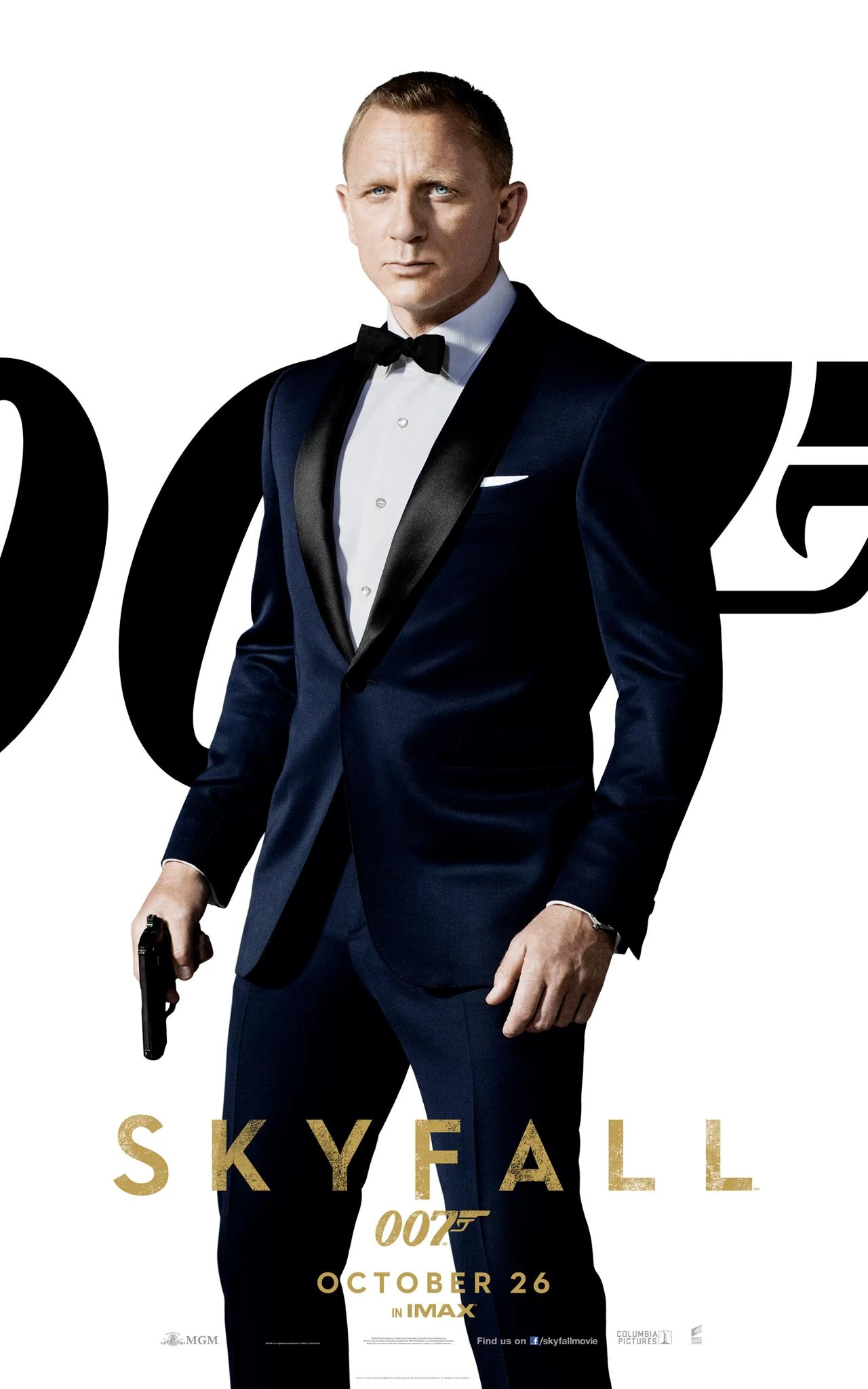
Analysis of Skyfall Movie Poster.
Skyfall's poster fits in with the classic reoccurring theme of the Bond franchise. Its very monochrome and barely features any colour apart from the gold for the title and other parts of important information that is needed to stand out, such as the release date and the classic '007' symbol to further signify that it is part of the Bond franchise. The title of the movie is the largest font on the entire poster and stands out against the otherwise dark poster. There is no one else featured on either poster apart from Daniel Craig who is famously known for being Bond so stands out immediately to be a Bond film.
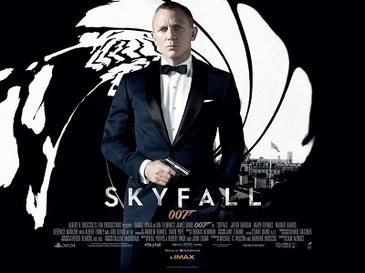
In the second poster the London skyline can be seen very clearly in the background behind Daniel Craig, there is also an English flag to top it off and further show the importance of UK National Identity to the franchise.
The film directly contrasts the poster as on the poster he looks very put together and is clean shaven whilst wearing a suit whilst in the actual film we see the degradation of Bond as a character as he gets old and useless to MI6 and goes off the rail and becomes messy as he rarely wears a suit and doesn't shave before he tries to get back to being a field agent and then starts to resemble the classic look again.

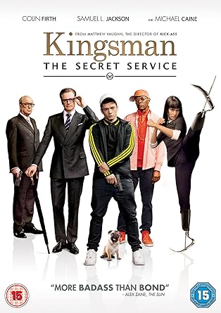
Analysis of Kingsman.
The poster for this resembles the Skyfall poster quite closely with the use of the colour scheme throughout being gold, white and black, particularly the gold title and gold for the important information which is exactly the same as the Skyfall poster. Unlike the Skyfall poster, pretty much all the main cast members are featured on the poster with the main character 'Eggsy' in the centre and also being the biggest individual to show his importance.
Unlike the Skyfall poster, all the characters are portrayed exactly the same on the poster as to what they are in the film, except 'Eggsy' who starts off looking like he does on the poster, in a tracksuit and then as the film progresses he becomes more professional and starts to dress in a suit which resembles Bonds look more and therefore relates to the spy, action genre.
In bold writing at the bottom it actually compares itself to the Bond franchise. However Kingsman is much more comedic compared to Bond films and plays on the fact that it is a spy film with the overuse of weapons and gadgets to almost mock the spy genre. These posters both feature the names of the main characters as even though it has a sequel now it was a new film that had unrecognisable characters unlike Bond who remains constant for a while.


Analysis of Moonlight.
This is the only poster to feature extremely vibrant colours in the poster. This movie poster directly links in with the film as it is a visual representation of the journey the main character goes through in his life, from being a young boy to a teenager and finally an adult. Out of all the poster this links in with the film and accurately represents it the most due to the use of using all three stages of his life into one image. The title is relatively small compared to the rest of the poster and therefore draws more attention to the main image which at first glance just looks like a normal image and then the more you look into it you see what is actually being shown. At the top of the poster it has a tagline of 'This is the story of a lifetime' which correlates directly with the story line of important parts of his life being shown that shaped his end character.
No comments:
Post a Comment